CSS: Layout on the Grid
Theory: First grid
Once you have the basic terminology figured out, it's time to create your first grid. In this lesson, we'll create a simple grid of 12 columns and 12 rows.
Let's start making the grid. As in the case of the Flex module, we need a container. Let's create a container with the class grid-12:
Next, we turn a section into a grid container, using the display property with the grid value.
It won't produce immediate visible results. So, let's add three child elements inside our container, give them a different design, and use these blocks as an example of a simple grid:
By not specifying the number of columns and rows, we ended up with a grid with three rows and one column. It is not usually the result we expect from grids. If that's the structure you want, you may not need grids. Sometimes, it's easier not to let the browser process what it doesn't have to process.
Another possible value for the display property is inline-grid. Everything will be the same as with a grid inside this container, but the container will behave like an inline element. It'll take up exactly as much space as necessary.
Other elements in the flow will be able to streamline it as needed and as space permits:
Creating a grid
It's time to create our first grid. Here we use the grid-template-columns and grid-template-rows properties. The first property is responsible for the size of the columns, and the second for the size of the rows. They can take many different values. Here are just a few of them:
- Any CSS units you know. These can be
px,em,rem, and so on - The
min-contentvalue. At this value, the column width will equal the minimum possible width. It depends on the content within the columns. - The
max-contentvalue. The opposite of the previous value. The column width will equal the maximum possible, considering the content of the columns - The
minmax(min, max)value. Here we see an integer function taking two values: the minimum and maximum size. In other words, we set boundaries within which the browser chooses the width - The
autovalue. The browser automatically adjusts all the columns so that the largest element in our grid fits snugly.
There are several other values, which we'll look at below.
Once you know the possible values for the strip, you may wonder where the specific number of columns or rows is specified. The point is that the grid-template-columns and grid-template-rows properties can take multiple values, separated by a space. Each such value is the size of one strip. In other words, to create a grid with 12 columns and 12 rows, we can specify values in each property 12 times.
Create an even grid with square cells. Let's make them 20 pixels each. Let's take the previous example and add new properties:
Now we've removed the height values for the container. It is because we calculate the width and height values from the size of the strip. There is no need to set these values additionally if you don't need a specific container size:
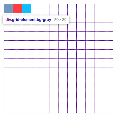
Note what happened to the elements inside the grid. Both grid-template-columns and grid-template-rows properties occupied the entire screen width available before we set them. Now each property occupies one cell with a size of 20 pixels by 20 pixels. It is easy to check in a web inspector, such as Chrome DevTools.
You can open it and hover your mouse over any of these elements. You'll see the entire grid and how much space each item has here:

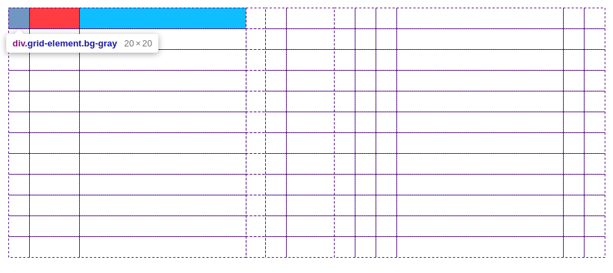
You don't have to use only one version of the values inside the grid-template-columns and grid-template-rows properties. You can set a unique value for each strip like this:
Pay attention to the size of the strips here.

Repeat
It is tedious to specify each column separately, especially if they're the same. You easily may make a mistake and get a grid you weren't expecting. To avoid repeating the same values, the grid-template-columns and grid-template-rows have a specific repeat value. More precisely, it's a function that takes two values:
- How many times to repeat the value?
- What value needs to be repeated?
Let's rewrite our 12-column grid using the repeat function:
The result is the same, but there's much less code, and it is easier to read. Which is great :)
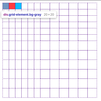
The repeat function is one of the possible values of the grid-template-columns and grid-template-rows properties. So it's possible to use it several times or combine it with other values. Let's assume that the first six cells vertically and horizontally need 20 pixels each, and the rest need 30 pixels. Then the CSS can take the following form:
Now, the grid in the web inspector will look like this:

In addition to roughly specifying the number of columns we want to repeat, we can use several other values:
- The
auto-fillvalue. The browser will repeat the columns as many times as it can fit. If the container is limited in width, the browser will place as many columns as possible without exceeding the container size. - The
auto-fitvalue. It is almost the same as the previous one, apart from one thing. If there's free space left in the container after we place all columns and elements, the browser will automatically compress all other strips to zero. It'll throw them out:
Be sure to look at what the grid looks like in the web inspector. You'll see auto-fill results in a 16x5 grid. Whereas, with the auto-fit value, the grid is 3x1. The browser just threw out unneeded strips with no elements in them.
Fraction Units
No, this is not about politics. In creating CSS Grid Layout, the developers paid close attention to adaptability. Now you adapt any web page if you care about the users.
So how do you adapt the grid? You can make do with relative units of measurement. This way can lead to more problems, especially if the number of strips in the grid changes. Once the number of strips has changed, you also need to change all the values for the size of the columns and rows. Not the most convenient way.
To solve this problem, the CSS Grid Layout standard introduced a new unit of measurement — fraction units. It allows you to specify how much free space should be occupied by the grid strip.
This unit works on the same principle as flex-grow, which we studied in the CSS: Flex course. Essentially, we're saying how many parts a cell should take relative to other parts.
Let's make a screen-wide grid with 12 columns and 12 rows. We should automatically determine the size of these strips based on the current viewport resolution. Now we have fr units, so the task is super simple:
Do it yourself
Using the lesson materials, create a 24-column grid. Try different values for grid-template-columns and grid-template-rows

