Bootstrap 5: Layout basics
Theory: Grid
The grid is the principal component of the Bootstrap framework, tried and tested in hundreds of projects. Understanding how the grid works in Bootstrap is an essential skill. It will help you create complex layouts without resorting to unnecessary style add-ons.
From the Grid course, we discussed that a grid is a system of invisible lines in which we lay out content in a template.
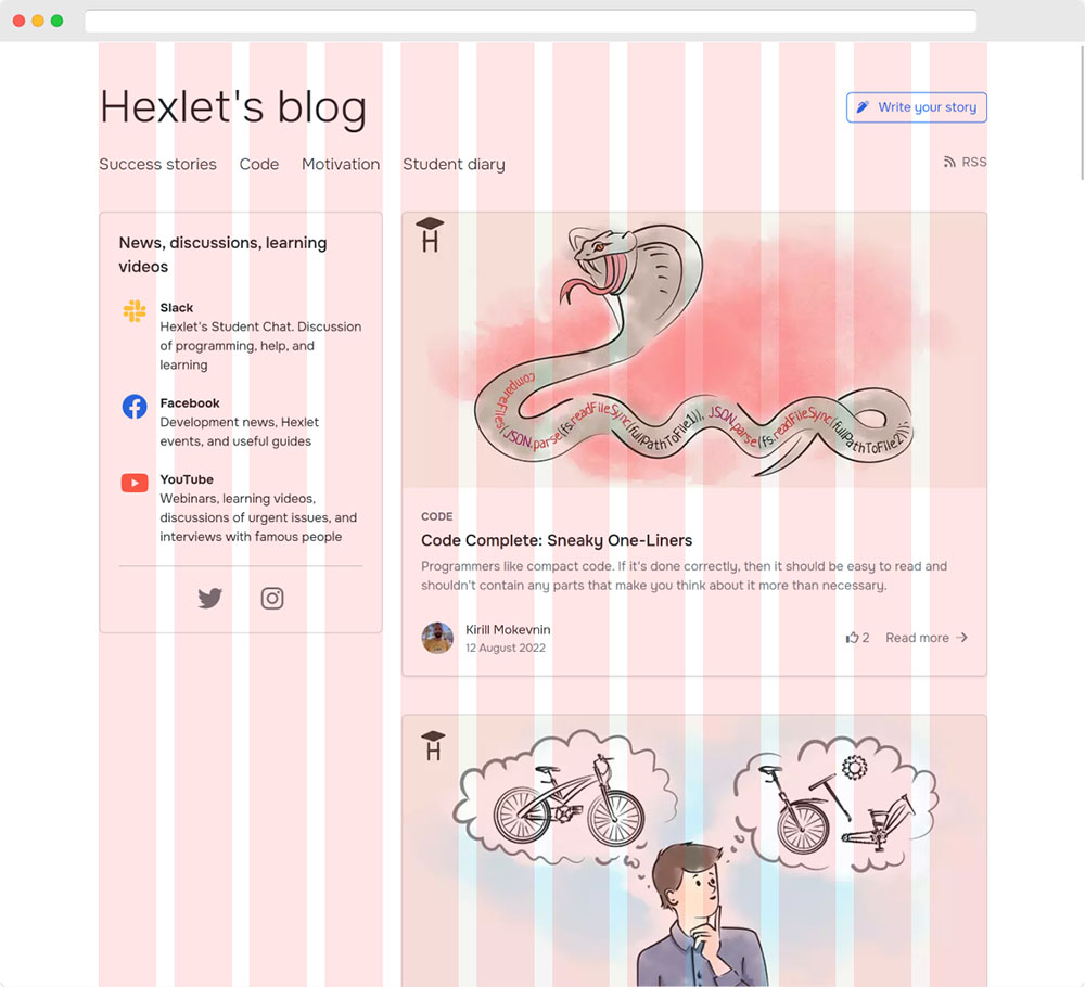
Take a look at the Hexlet blog template:

Here you see the project grid:
- The dark lines indicate columns
- The orange ones — the indents between them
Grids in Bootstrap are responsible for block layout and adaptivity. They determine how we display the content blocks at different resolutions.
We can break down the grid into three constituent parts:
- Containers
- Strings
- Columns
As an example, we use code with the Bootstrap grid:
This layout demonstrates the container → row → column approach. Adding text to a column with the .col class will produce the following layout:

Visually, it may seem that nothing much happened. The text is displayed as if we did not add containers, rows, or columns. But this is not the case! The mechanism for the adaptive grid and the lining up of columns has already started. Let’s add another column with the identical text:

The two columns are the same width. It’s time to take a closer look at the classes described in HTML.
Containers
The container is an essential element of the Bootstrap grid. The purpose of the container is to limit the width of the content. By default, content in Bootstrap has a maximum width of 1140 pixels. This condition is due to accessibility. The text is organically placed across the width and fits about 120 characters in this framework. If you have too many characters, it is too difficult to read since it’s harder for your eyes to move between lines.
We can bypass this limitation. Bootstrap uses the .container-fluid class for this, which doesn’t limit the width of the content within it. The two-column layout from the example above using .container-fluid will look like this:

The container stores any content type. If you don’t need a grid for elements, you shouldn’t create a string with a single element inside it.
Do not put the container inside another container. It is bad practice. If you need several containers, separate them rather than nest them. If you notice during markup that you need a container inside another container, calm down, have some coffee, and reconsider your approach.
Rows
Like with tables, rows are an inherent attribute of columns. The Bootstrap row acts as a flex container, where we place the columns' flex elements. If you don’t wrap the elements, the columns will stop working.
The .row class has the following styles:
We use the negative outside indents because columns within Bootstrap have internal indents that separate columns from each other by a fixed value of 30 pixels.
Here you see negative indentations for the container .row to compensate for ones on the left and right and not form extra ones in the first and last element in the row.
The .row contains only columns, ensuring proper nesting and the ability to create adaptability.
We moved third-party elements outside of .row.
Since .row is a flex container, it’s possible to apply to it the available properties shown in the Flex course.
The col and col-* classes
The example with the two-column layout used the .col class, which distributes space evenly between the columns with these classes inside the .row container.
This operation is often not necessary in layouts. We usually need to give blocks their number of columns.
Bootstrap is a 12-column system, meaning we have the .col class plus twelve .col-\* class columns available when creating a grid.
The \* symbol is the number of columns the item will occupy:
In this example, the first part of the text got four columns out of twelve, while the second part got eight out of twelve.
Bootstrap automatically moves columns if they add up to more than twelve parts. We don’t need to worry about this when adding a new element if there are fewer columns in the row.
We can combine the .col with the .col-\* classes. It will allow you to limit the necessary part, automatically calculating the space for the column with the .col class.
For example, when you create a two-column layout, you specify col-* for the sidebar and .col for the content part:
You may have guessed you can have absolutely any content inside the columns. In that case, any element can play the role of a column:
A structure such as a container → row → column is mandatory. Note that every time you create a grid with Bootstrap.
Excluding the container from this chain is a common mistake. The.row isn’t directly dependent on container styles, but we can lose the internal indentation compensations and the content alignment for different viewport sizes if you don’t specify a container.
Completed
0 / 10