CSS: Site Adaptability
Theory: Checking site adaptability
Testing on real devices
Checking the adaptive layout is a significant part of layout design. Doing it during the creation process allows you to control the entire development process and quickly fix styles without changing a whole layout simultaneously.
So, how do you check for adaptability? The best option is to have dozens of different devices with different resolutions — phones, tablets, and anything. But let's face it, not many people have that many devices. In this scenario, you constantly buy new devices, which isn't easy on the pocket.
Because of this, the first step in checking the site's adaptability is to use the devices you already have. Don't forget about the cross-browser compatibility — display the layout in different browsers.
One way you can get out of checking with different devices is to use special software.
Developer tools in the browser
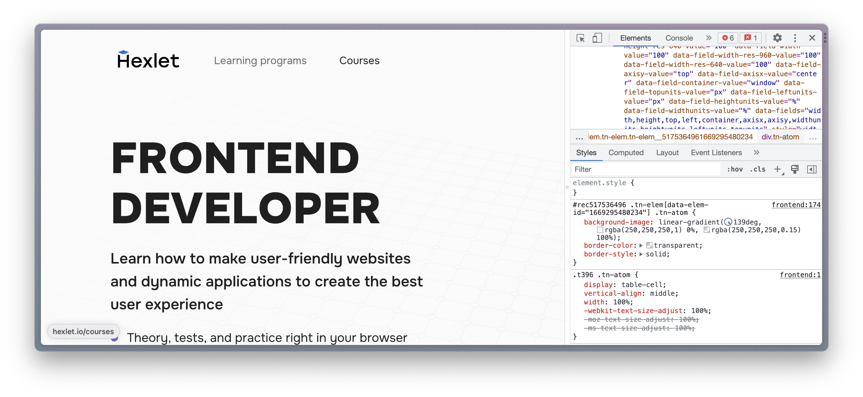
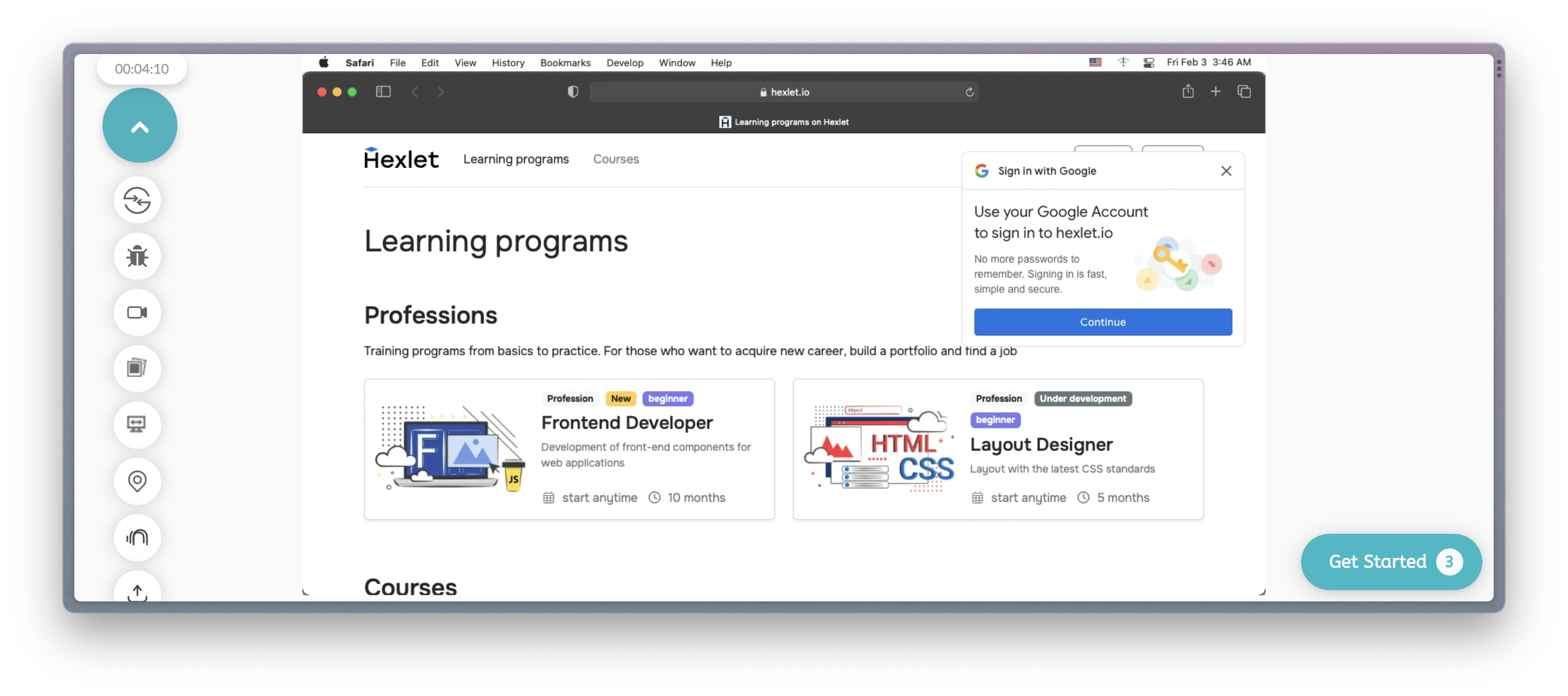
Almost all modern browsers allow you to view the site as it would look on different screen resolutions. Using the Google Chrome browser as an example, let's check the professions page on the Hexlet site.
It requires:
-
Go to the page we want to look at
-
Open the developer panel by pressing Ctrl (CMD) + Shift + I:
-
Switch to Toggle device toolbar mode by pressing Ctrl (CMD) + Shift + M:
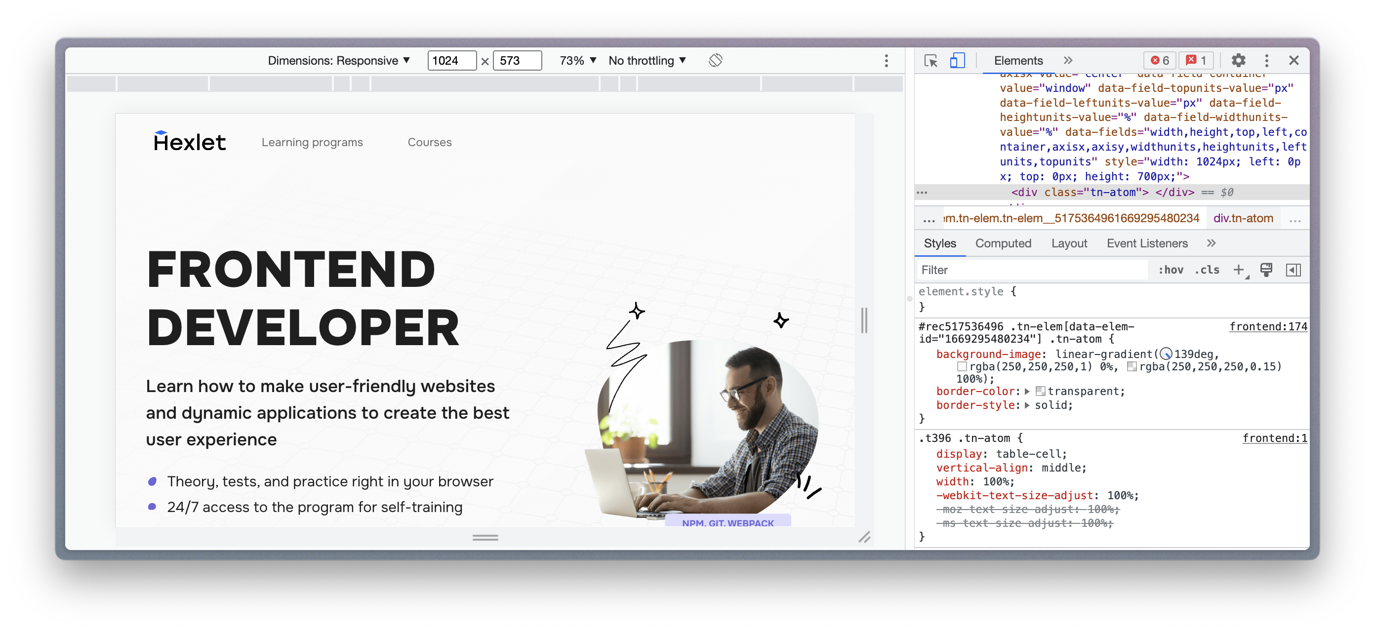
Now you can select different types of devices or set the desired screen resolution and see how the site looks.
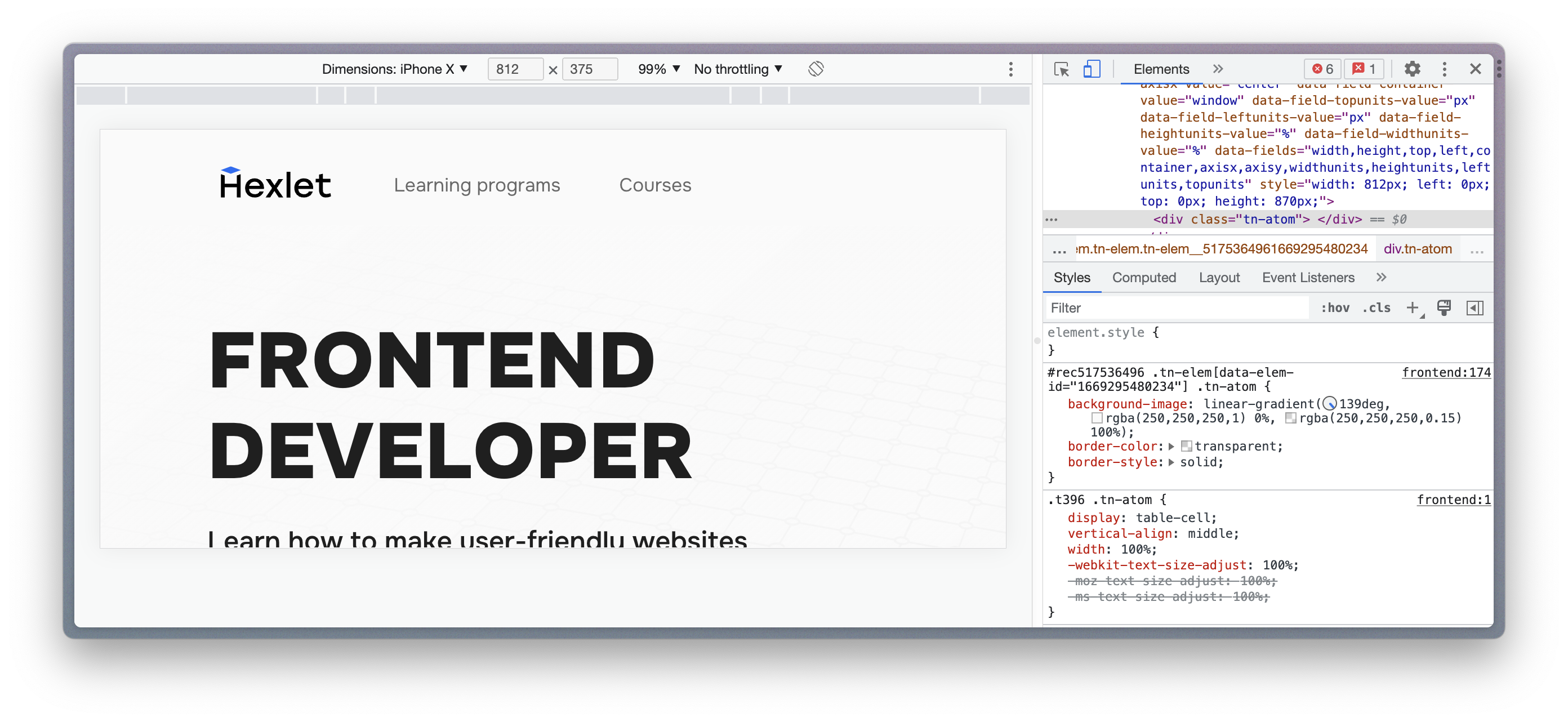
For example, let's observe a Hexlet page on iPhone X in landscape orientation:
Online services for checking adaptability
In addition to the built-in browser tools for checking adaptability, there are special online services. They can show the site's appearance on mobile devices and point out typical errors like insufficient element contrast or small font size.
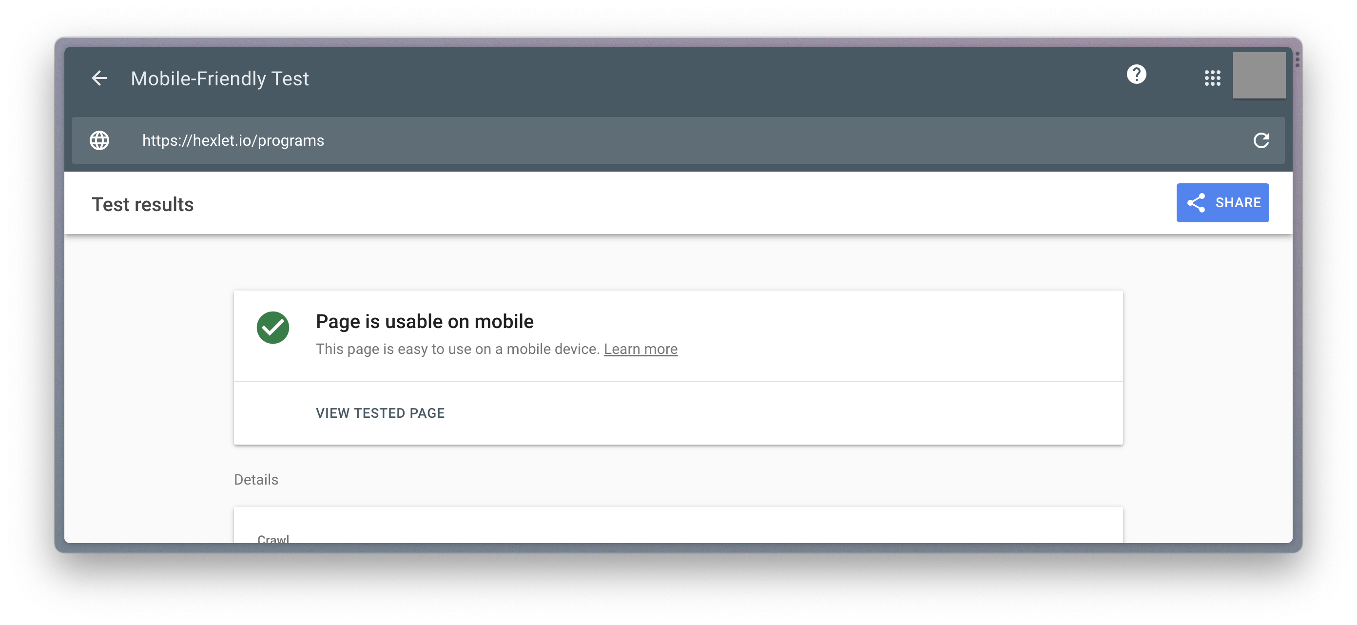
You can check a website's adaptability using a service called Mobile Friendly by Google. If you put your page's link in the service, you'll get a message about whether your site is optimized for mobile devices:
If your site is listed in the Google Search Console, you can see these statistics for all pages.
Another popular service is BrowserStack. Although it's a paid service, its capabilities allow you to check the page in almost all available combinations of operating systems and browsers. The site has a free period during which you can test your pages and see how the application works:
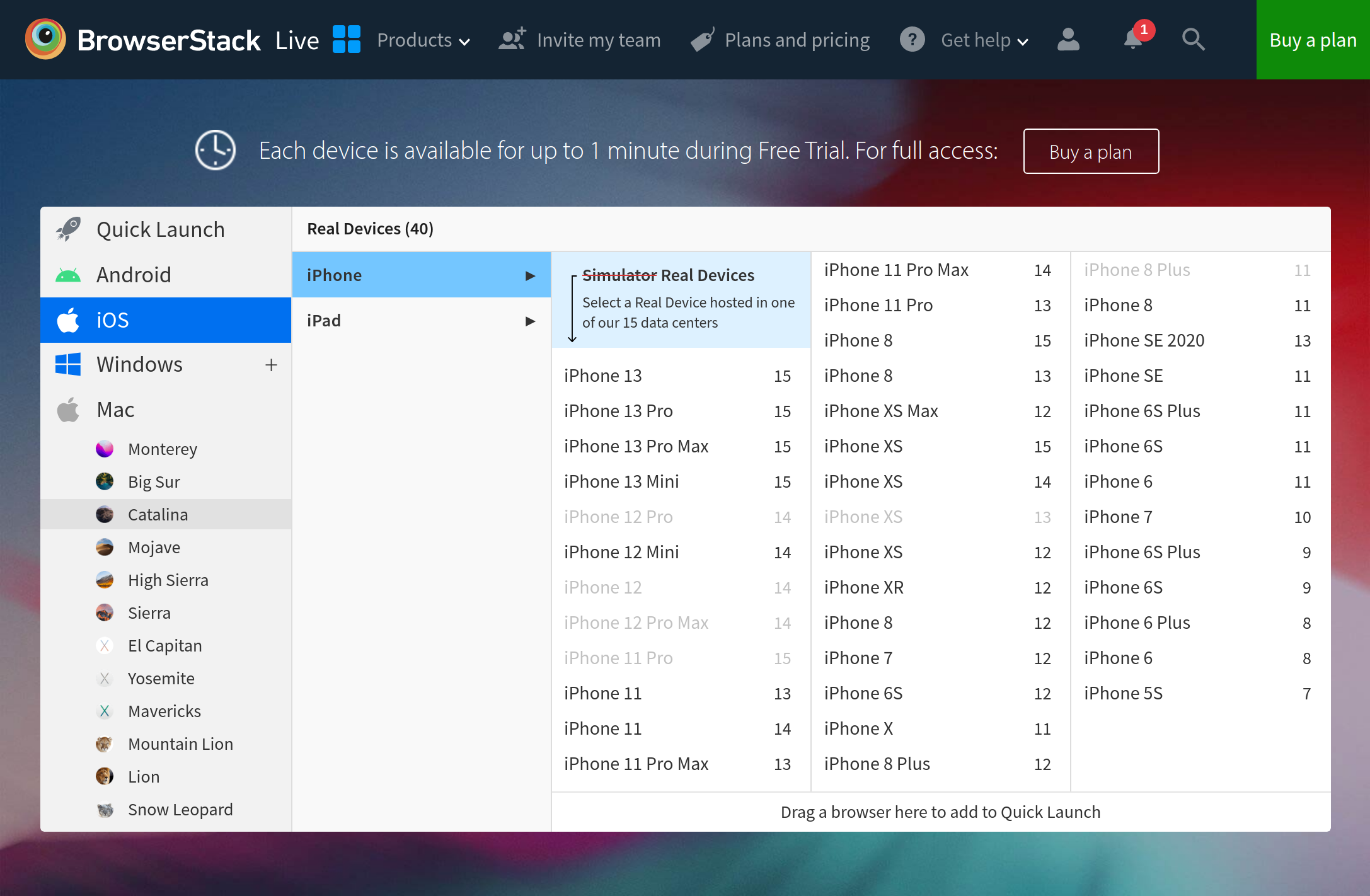
BrowserStack is often used in companies, so knowing it is a good skill for any layout designer:
If the team's budget is limited, we recommend using the service Lambda Test