Content layout fundamentals
Theory: Text styles
Creating a page is, first and foremost, working with text. No matter how beautiful the design may be, if the information is difficult or impossible to read, then the user will leave pretty quickly. CSS has a wide range of possibilities for styling text. In this lesson, we'll look at the basic styles that can be applied to text. It is impossible to describe them all in one lesson, and we don't really need to. As you gain experience, you'll learn about all sorts of new properties, but they're all based on a few basic ones:
- Text color
- Text location
- Text margins
- Text size
Text color
Each piece of text on a given page has its own color. It might be a headline or a massive banner telling you about discounts. Any text has color. CSS uses the color property to manage it. It can be used to set any color for different parts of the text. The property takes color as a value in different color space models. The RGB model is particularly common. It shows how much red, green, and blue is used in the color. You can use online services that will show the chosen color in that model. One such service is HTML Colors Codes.
The first thing that developers set up when doing page layouts is the color of the main text of the page. Since the color property is inherited, it can be set for the <html> or <body> tag. With cascading, this color will be applied to all text unless otherwise specified. Let's choose a dark charcoal color, which is #333333 in the RGB color model.
Interestingly, it's quite rare to see #000000, i.e., the blackest possible black in this case. That's because this color doesn't occur in nature and doesn't look quite right to the human eye.
Highlighting a section of text in color is a common way to attract attention. Various advertising banners are constantly trying to tell us about an incredible discount or some offer ending today.
Setting text color isn't an easy task. Besides designing text and coordinating colors, you also need to think about accessibility. Whatever color you choose has to be comfortable to read. The text needs to contrast with the background. Light gray text on a white background will be difficult to read. Therefore, for the main text, it's best to use black or nearly black on a white background.
Contrast applies less to headings and small selections within the text. They stand out from the general background by other characteristics, such as weight, size, borders, and their own independent background. Such text should also have sufficient contrast, but it can have values lower than the main text.
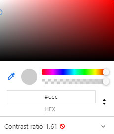
You can use the Chrome DevTools Web Inspector to check text contrast. Select any color in the Styles tab, and the browser will automatically display the contrast ratio of the text. It's designated as a Contrast ratio. If the contrast is within acceptable limits, it'll get a green checkmark. Otherwise, a red circle will be shown.

Text alignment
Text alignment is a crucial technique for emphasizing text on a page. Non-standard alignment means the user may notice the text faster. As well as text size and color, editing header alignments is also common practice.
The text-align property is used for text alignment, and it takes the following values:
left(default value)centerrightjustify. This value aligns the text so that the text goes from one end of the space to the other, making the text evenly aligned. You can also change the size of the spaces between words
Important: using justify is bad practice. This technique is used in book design, where it's possible to edit the text so that the width alignment doesn't create large gaps between words. However, when it comes to web pages, this is nigh on impossible.
The text-align property is also inherited. If you set it for a block, all text inside it will be aligned according to the value of the property.
Left-aligned text. This value is the standard, so there are no visible effects
Text weight
You can quite flexibly adjust text thickness using CSS. Thickness is used to highlight an important part of the text and gives it weight relative to its neighboring elements. The font-weight rule is used to control thickness in CSS. It takes the following values:
- Values from
100to900in increments of 100 lighter- superfine letters. Makes the text less thick than the current valuenormalis the default value. It corresponds to400bold, corresponds to700boldermakes the text thicker than the current value
For many fonts, only normal and bold are available. This has to do with how many different sizes the font creators include.
Text size
You can control the size of the text using the font-size property. Text with a large font size is the first to catch the eye, so things like headings are usually thicker and have a bigger font size.
Compare headings created using <h1></h1> and <h2></h2> tags. Their main visual difference is the size of the text. In addition to the built-in styles, we can set the font size ourselves. You can use pixels as a unit of measurement (px). In future lessons, you'll learn about other units of measurement and how you can use them to tailor content.

