Content layout fundamentals
Theory: Intro
Working with content is an essential aspect of any project. Behind all the beautiful animations, panels, and images is all sorts of hidden content. The content is what the user comes to a website or opens an app for. The user's mood often depends on how good the content looks and feels.
In this course, we'll go through the fundamentals of working with content and how to make animations. You'll learn:
- how to create styles for fonts and lists
- how to create and style tables
- how to use columns using the
columnsproperty - about the different units of measurement and how to work with them
- how to create forms and use media elements
- the basic rules of animation and typography
- how to make content accessible
Practice
Many of the lessons in this course will include a practice section with a web view. It's a good idea to do more than just complete the task. Once you've completed the task successfully, try experimenting with the code and the features you've learned.
Practice segments in this course are built around a system of snapshot testing. Unlike other courses, this one doesn't check against the values you specify, but rather takes a screenshot of the page with your styles and compares it to the screenshots from the teacher's solution. You can easily see how the page should look at different viewport resolutions.
You can see screenshots with styles from the teacher's solution in __tests__/__image_snapshots__.
Testing the solution
Students' solutions are mostly tested using the Visual Regression Testing method, i.e., by comparing screenshots. Without going into technical details, the test is as follows:
- The exercise contains reference screenshots that were taken based on the teacher's solution
- When you click on the "Check" button, the student's solution is sent to a Chromium-based browser and screenshotted
- The screenshot is compared with the reference screenshot, and then the tests give a text result of the comparison
If there's a difference of more than 2% detected, the system will produce one of two possible errors:
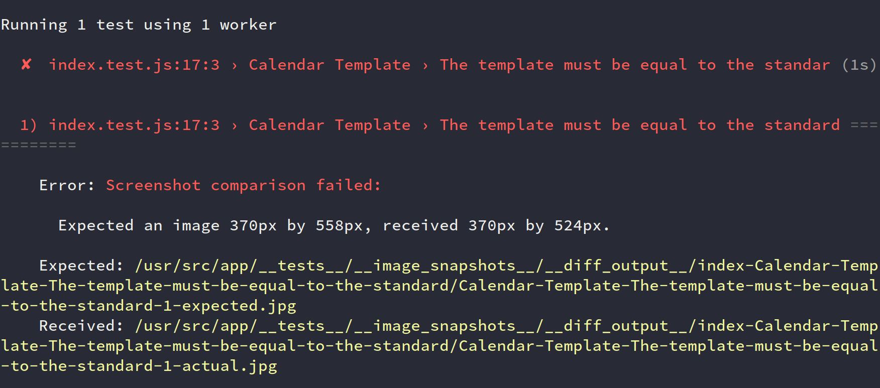
Different sizes of screenshots

The system says that the dimensions of the images do not match. In this example, the reference screenshot is 370px x 558px, and the comparison screenshot is 370px x 524px.
Most likely, there is a problem with the indentation/height or line spacing. Carefully analyze the screenshots, in the __diff_output__ directory. The specific path is given in the test output, and the files can be found in the left area of the exercise.
You'll find two files:
- name-test-actual.jpg – the screenshot of your solution
- name-test-expected.jpg – the reference screenshot
Visual Differences

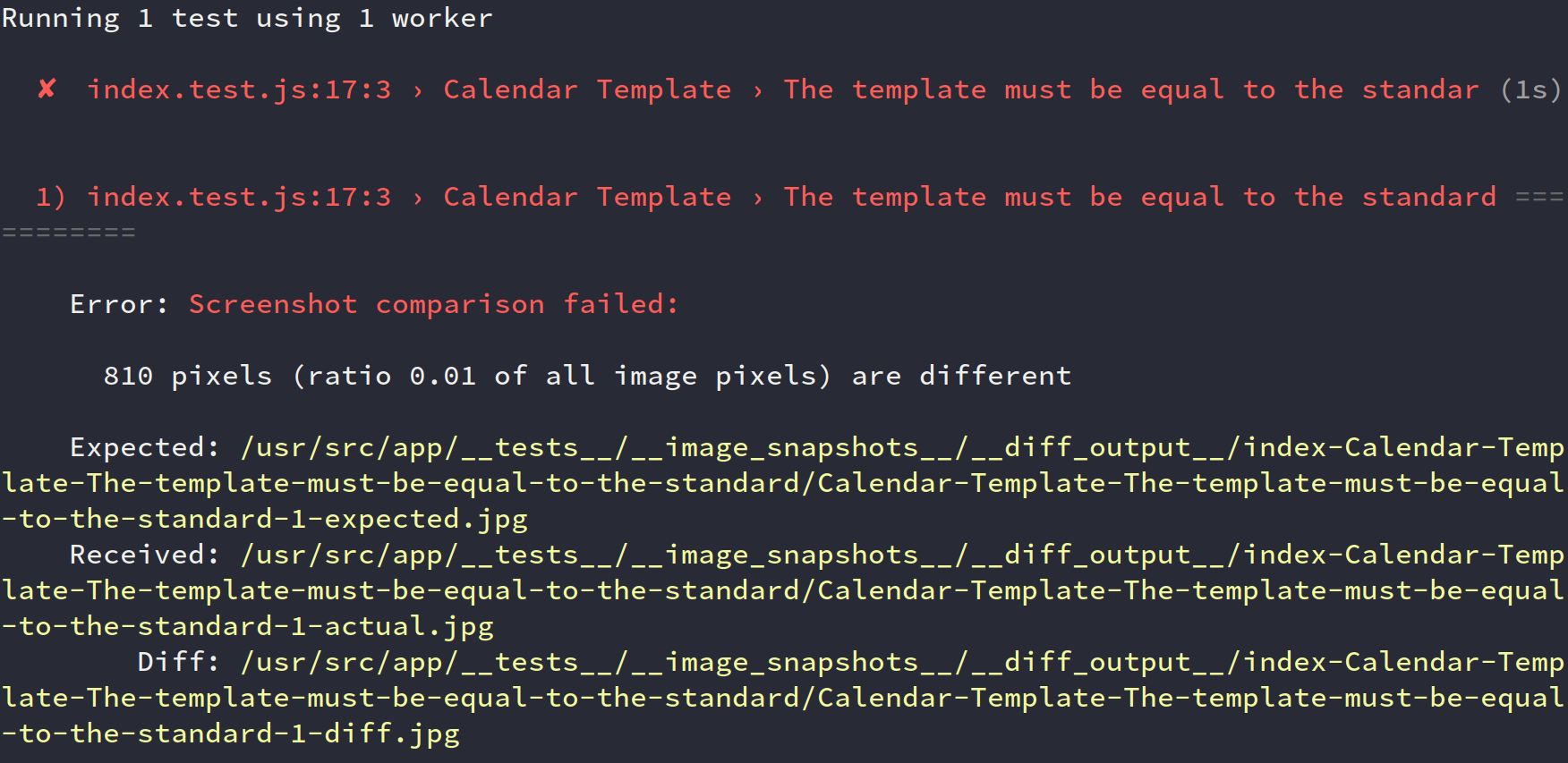
In this test, the system is reporting that the images have an 810-pixel difference. In this case, three files are generated instead of two:
- name-test-actual.jpg – the screenshot of your solution
- name-test-expected.jpg – the reference screenshot
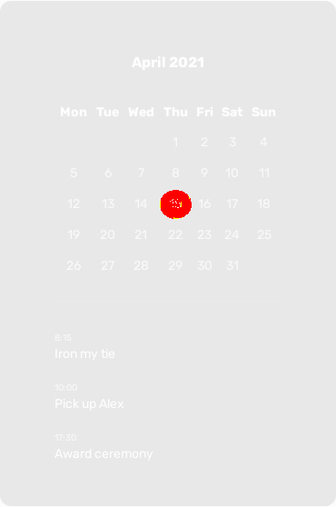
- name-test-diff.jpg - the screenshot obtained by overlaying the student's screenshot and the reference screenshot. This is how you see the areas that are different
The screenshot with the differences looks something like this:

The places where the differences were found are highlighted in red. In this case, you can compare the screenshots yourself.
Important: fix the differences going from top to bottom. Often there is a situation where a small error in the indentation affects the entire screenshot. It looks like everything is wrong, but only one property needs to be fixed
CodePen
Another opportunity to apply the skills learned in the course is to use the CodePen service. You can create your own pen, where you can experiment with properties.
Additionally, there'll be examples that are loaded from CodePen in each lesson of the course. They're available for review, and you can make edits in real-time and monitor the result. Don't miss out on this opportunity.
Don't forget to practice all the time, that way you boost your content markup skills and be able to quickly and skillfully design all the content on a page or app.

