Content layout fundamentals
Theory: Columns
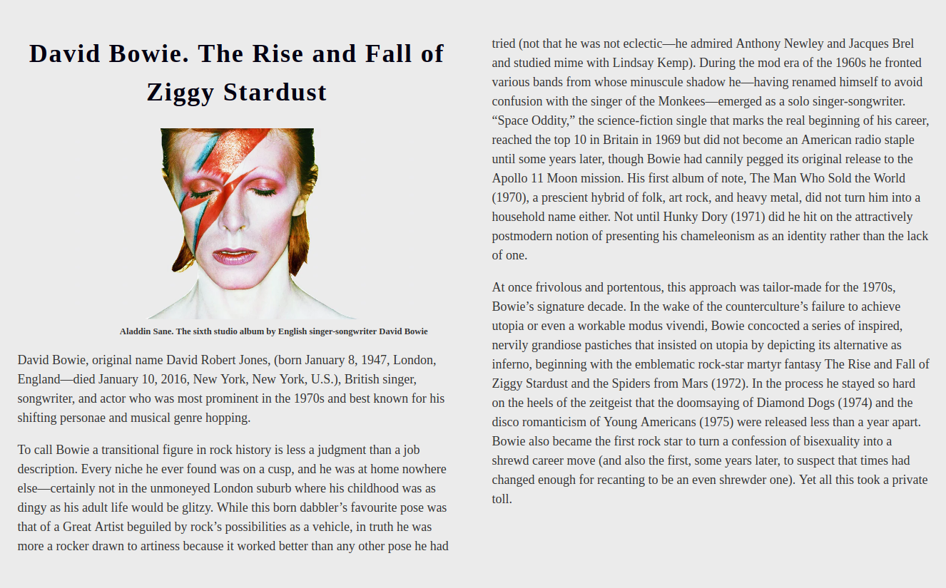
Creating columns of text before the arrival of the CSS3 standard was quite difficult. People had to use different positioning properties and make sure the columns didn't fall apart while adding information.

Look at the example above. While it looks easier, creating this layout was very difficult. The most common problem was text moving around in columns. To solve this problem, we used several blocks with information strictly positioned in one place. Text moving around by itself or the article changing was out of the question.
Now this problem can be solved using only two(!) properties. We'll look at these and some other properties in this lesson.
Creating columns
To create columns in CSS, we can use the column-count property. It does exactly what it says. Just specify the number of columns and the browser will do everything for you.
Important: the information inside the columns is processed as is. This means that all the indents are preserved. When it comes to paragraphs, it is worth getting rid of the upper padding. This will keep the first paragraph in line with the other columns.
By default, the columns are divided evenly inside the container, and they'll take up all the available space. You can influence this behavior with the column-width property and set the optimal width of the columns. Optimal is the operative word here. Unlike the width property, you don't set an explicit width here, and if there is enough space in the container, then the columns will stretch to the full available width.
Why is this behavior necessary? Imagine we have a long text in two columns. For example, like on the image above. Without specifying the optimal width, the browser will line up the two columns based on the width of the device, regardless of what it may be. If this width is 300 pixels, then the columns will be 150 pixels each. It looks horrendous.
To prevent this, you can set an optimal width. If the browser can't make one column that width, then all the content will be lined up in one column. So much for adaptability. And these are just the first lessons :)
Go to the CodePen website and try narrowing your browser window. At a certain point, the columns will go away, and all the text will be lined up in one column.
Column spacing
You may have noticed in the examples above that browsers automatically put spaces between columns. More often than not, you shouldn't trust the browser. One of the rules of designing layouts and programming is that explicit is better than implicit. By default, the distance between columns is 1em. The em unit is calculated based on the font size. If the font size is 16 pixels, then 1em is 16 pixels.
You can set the spacing between columns using the column-gap property. You'll see this property a lot. It's pretty versatile.
You can use different units within the column-gap property. Let's take the values in pixels as an example. In future lessons, you'll learn about other units of measurement.
Try changing the value of the column-gap property and see how it affects the columns.
Borders between columns
The CSS Multi-column Layout module allows you to define a visual border between columns. If you're familiar with the border property, which sets element borders, then you'll be familiar with the behavior already. Previously, creating borders between columns had to be done yourself, much to layout designers' chagrin.
The column-rule property is used to create the border, which is a shorthand version of the following properties:
column-rule-width– the width of the bordercolumn-rule-style– the border type. The values are the same as those from theborderpropertycolumn-rule-color– the color of the border
You can specify either three separate properties or use shorthand notation.
Spreading content across multiple columns
If you imagine a newspaper, the text isn't always strictly in columns. A common situation is that the headline, which is placed over all the columns, seems to separate them horizontally.
The column-span property is used to separate columns. It takes just two values:
none- the default value. The text is just inside the columnsall- the text sort of comes out of the column and separates them
Columns overflow
In the examples, you can see that all elements inside the columns are moved automatically. It's not a bad solution for text, but if there are small blocks, and we definitely don't want the information inside them to be moved around, then we need a few other properties. So, how do you control the overflow of content within columns? There are several rules for this, which we'll talk about in this section.
break-beforebreak-afterbreak-inside
You can already tell by their names that it refers to moving items before and after and inside. All three properties take on a huge number of values since they are designed not only for columns but also for printing.
When working with CSS Multi-column Layout, we are most interested in the avoid value, which prohibits any breaks.
Take a look at the <figure> element. It consists of an image and a caption. For clarity, let's put a border around it and see that the image is in one column and the caption is in another. This is a bad text layout. Without a border, it is completely unclear that the text is just a caption for the image and not a piece of independent text.
This break happens within the figure element. To prevent such a break, you can use the break-inside property and disable it within this element. Find any newspaper article. Use CSS Multi-column Layout to recreate the layout.

