CSS: Site Adaptability
Theory: Media queries and other devices
Using media queries as a condition allows you to set the width/height and screen orientation. Also, it helps to specify the device for which we want to apply the styles.
The CSS3 standard defines four basic types of devices. We can specify them as media query conditions:
all— all available devices. This type is the default, so you don't have to specify itprint— printers. These styles help to print a web page. Separate printable CSS is in demand when creating online stores because users often print the page with the product they wantscreen— all the screens of the different devices. It includes both refrigerator displays and 4K monitorsspeech— screen readers or text-reading software. It helps vision-impaired people perceive the information on the page
Let us observe the example below:
You can specify the device type when connecting a CSS file as you can with other media queries:
In addition to specifying a particular type of device, CSS allows you to enter the device's specific characteristics for which you want to apply styles.
The main features that most browsers support are:
-
color. The number of color bits the device is capable of reproducing. If no value is specified, it checks that the device can reproduce color -
monochrome. The device is monochrome if it can reproduce only two primary colors, black and white, and shades of gray. These include ebooks -
orientation. It is a self-explanatory characteristic, which we discussed in more detail in the last lesson -
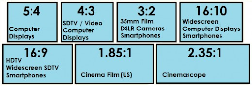
aspect-ratio. It shows the aspect ratio of theviewport. For example,16/9or4/3. If theviewportresolution is 1280x720,aspect-ratiocan take any multiple of that resolution. That way, we can make the styles for that resolution to apply. For example, you can specify16/9,32/18,1280/720, and even2560/1440:
-
device-aspect-ratio. A characteristic is similar toaspect-ratio. It takes into account the resolution of the device itself rather than theviewportresolution:
Additional materials
Do it yourself
Create any page on your computer and try adding all the features in the media query condition so that the styles work on your computer.

