Modern layout fundamentals
Theory: Box model
Imagine the process of building a house. Generally speaking, it can be divided into several stages, building the structure of the house and then adding details. When building a house, we lay down the foundation, erect walls, and add the roof. Then we continue with the house painting, window installation, and decoration.
The process of designing layouts is similar. The role of structuring and finishing is equally important. There are several basic element types for this:
- Block-level elements. These elements are responsible for the page's basic framework
- Inline elements. They help us in the process of styling a page or adding functional parts
It's important to note that HTML elements themselves are not the block or inline elements. HTML is just markup, and CSS is responsible for whether the element is a block or an inline element. For all HTML tags, there are standard output patterns that are configured by default in the browser. Therefore, the concepts of block and inline elements are usually related to certain tags because they have a certain standard behavior when they're added to the page. In these lessons, whether or not the tags and values correspond with each other is conditional because this behavior can easily be changed using the CSS display property.
Block elements
The major feature of block elements is that they take up the entire width available to them. As a result, the items before and after the block elements do not stand in line with them but move to the line before or after them.
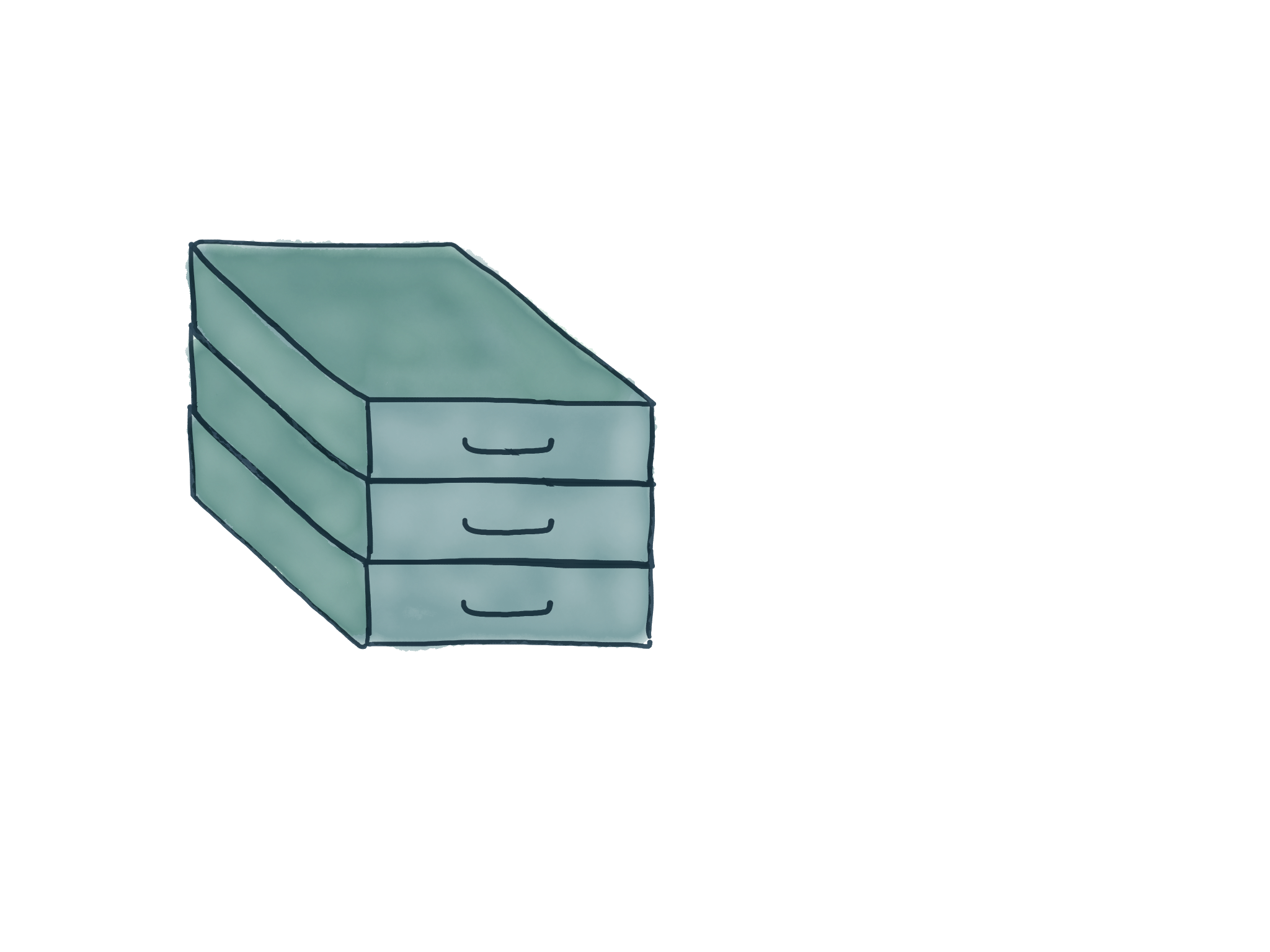
Imagine you have a closet and some boxes that are the same width as the closet. In this case, we can't put the boxes next to each other because we won't have the space to do so. The only solution is to put boxes on top of each other. Block elements behave in exactly the same way.

In HTML markup, such boxes might look like this:
We can already clear from the markup in this example that the div element is a block element. It occupies the entire available width, and because of this, other elements don't line up with it.
It's worth noting the concept of "occupies the entire available width" separately. Where does the available width come from? The width of the whole page, the width of the screen, or the width of the Pacific Coast Highway? Actually, the available width is the entire available width of its parent. I.e., if our block is inside the body, then this width will be equal to the width of the body. If you change the width of the body, it'll immediately change the width of the block element inside.
What other elements are block elements? In fact, there are so many that just listing them won't do anyone any good. As you go deeper into the layout, you'll be able to discover which elements are block elements for yourself. The main block elements are:
<div><p>- List tags
<ul>/<ol>/<li> - Headings
h1-h6
We can put other block elements inside block elements. This allows us to make complex layouts, working with the various components that will be created.
As you can see, we put other blocks like this inside the div block elements, as well as the header and the paragraph. Nesting can go as far as you want.
It's important to note that although HTML allows you to nest blocks as much as you want, it's best to be grounded by common sense. The fact is that outputting the layout takes browsers' time. It requires a lot of resources. And the more blocks there are nested into each other, the harder it is for the browser and your computer to process it all.
Nesting block elements are limited to only a few points:
- You can't put headers in headers
- You can't put paragraphs in paragraphs
You probably won't have a problem with that, because it's rather difficult to imagine a header situation within a header.
Inline elements
Line elements are a sort of "finishing material" which we can use to highlight sections of text, or add a bit of logic, as is the case with links. String elements are the opposite of block elements. They don't occupy the entire available width, so there's no need to move any neighboring elements.
Let's add an inline element to the last example:
What happened? We've wrapped the word here in a link that will take the user to the place we specify. What happens in the browser when this tag is added? The link will turn blue, and it'll be underlined. But the text itself will remain in place because the width of the link will be equal to the width of the word here.
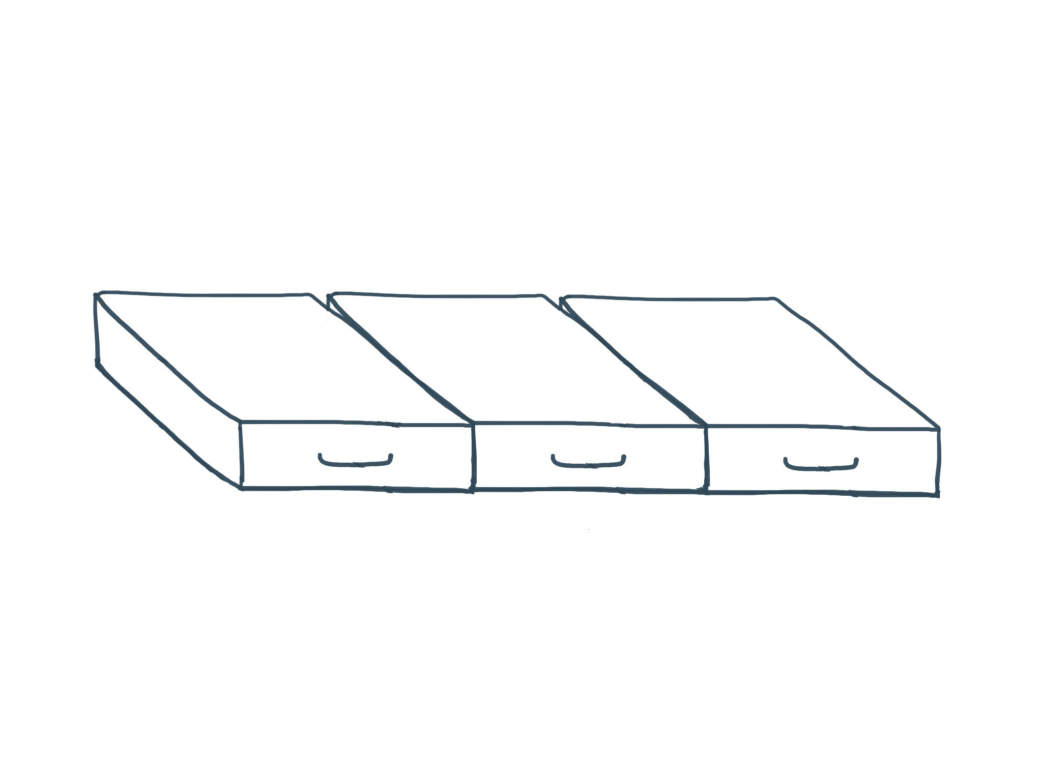
If we imagine our inline elements like boxes, they're arranged as follows:

This is the main distinguishing feature of inline elements. In addition, there's an important feature related to the use of width and height properties in CSS. These properties do not work for inline elements. Using them won't have any effect.
The most commonly used inline elements are:
<span><a>- Text selection tags
<i>,<em>,<b>,<strong>
Just as with block elements, we can put inline elements inside inline elements. It's a common practice that you'll find useful. For example:
Important: Don't put block elements inside inline elements. This breaks the semantics and makes the code harder to read.
Document box model
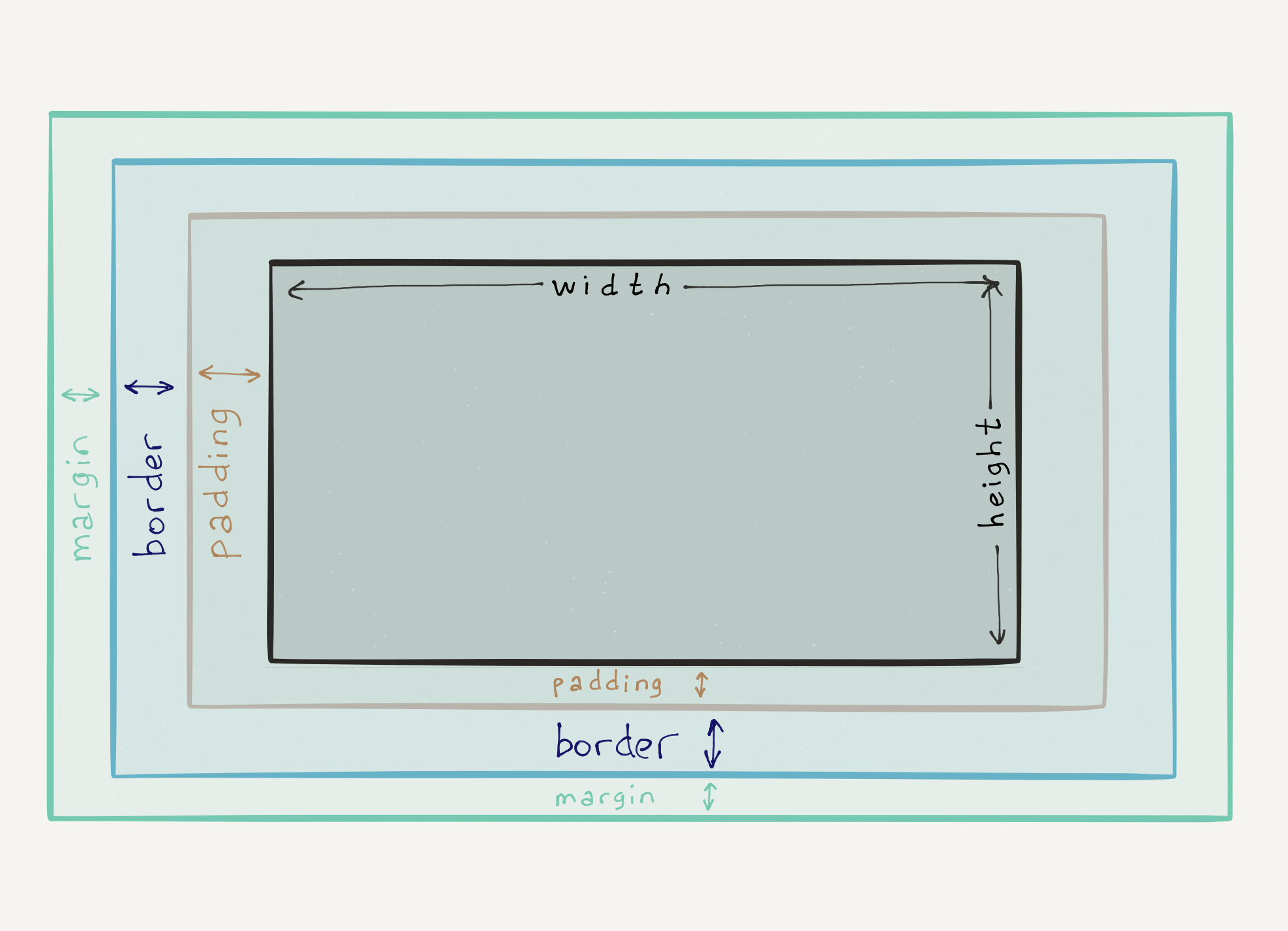
Even before working with CSS, it's useful to understand how the browser displays elements on your page. In addition to the natural height and width properties, any element on a page can have the following properties:
padding- internal indentation in the elementmargin- external indentationborder- the element's visible borders
Each of them not only performs the function specified but also directly affects the final values of the height and width of the element.

Imagine we have a square with a side measuring 150 pixels. We added a border that is 2 pixels thick, 10-pixel padding on each side, and 20-pixel wide margins on each side.
How much space will our square take up on the page? To do this, we need to add up all the values.
Width: 150px (start width) + 2px (right border) + 2px (left border) + 10px (right padding) + 10px (left padding) + 20px (right margin) + 20px (left margin) = 214px
Height: 150px (starting height) + 2px (top border) + 2px (bottom border) + 10px (top padding) + 10px (bottom padding) + 20px (top margin) + 20px (bottom margin) = 214px
Do it yourself
Use any online service that can convert HTML markup. For example, https://htmlcodeeditor.com/.
Insert the following markup in the left part:
Try changing block and inline elements, and adding and removing them. See how the behavior changes.


