CSS: Transform (Transform objects)
Theory: 3D Transformations fundamentals
Today, there are many ways to create three dimensions on the page, but CSS allows you to do it natively, i.e., without using third-party plug-ins. In the remaining lessons in this course, we will look at everything related to transformations in three-dimensional space — from creating elements to distorting them.
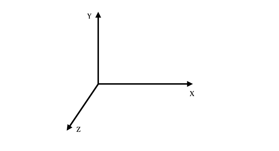
How is a 2D object different from a 3D object? Scientifically speaking, there is a new axis of coordinates. In the previous lessons, we did transformations on only two axes: x and y. In 3D space, an additional z-axis appears, which allows us to add depth to an object:

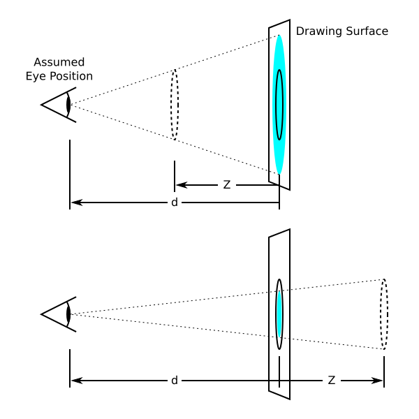
In the second part of the course, we will learn how to work with the z-axis. We will introduce the concept of perspective — the distance between the screen and the element location along the z-axis. Our brain relies on perspective to determine whether an object has three dimensions.
Perspective
We set the perspective on the parent object within which there will be elements with transformations.
Consider the following example. It has the same object styles and animation with one difference — one of the scenes has a perspective of 800 pixels.
Let us notice how the elements rotate on the x-axis. In the perspective scene, there is depth, so they do not just visually change the size. Also, you can see how exactly they rotate.
In the two-dimensional scene, this rotation is achieved by compressing and decompressing the element, rather than rotating it directly, since there is no additional z axis:

You can control the perspective in CSS using the perspective property. We can use any value to define the size: px, em, rem, and so on. The property shows what position along the z-axis the element is located at.
Note that the greater the value, the farther the element will be from the viewer. It means that its transformations will be less noticeable than those of a closer object. But there is also a problem here, a low perspective value can deform an element in a different way than we expect it to:
In this example, we can see that the smaller the perspective, the closer to us the rotation occurs. At 200 pixels, it feels like the block is rotated right in front of our eyes, which means we distort the object. With a perspective of 5000 pixels, we do not see the effect as much because it is very far away from us. If you increase the value to 20000 pixels, the resulting rotation will be similar to what would happen in two-dimensional space.
Viewpoint
We do not talk about opinions but our actual viewpoint of an object — our position on the left, right, above, below, slightly to the side, and so on.
Changing the viewpoint affects the way the object transforms. Gradually change the position of your head or the object and notice how you see the same rotation from a different angle:

We use the perspective-origin property to define the viewpoint. Its value is similar to the transform-origin property. But here, we define not the transforming point but the observing one. By default, this viewpoint is the center of the object as follows:
In the example above, we use only one of the three values for each block. Notice how the perception changes from the rotation of the object at different points of view:
Note that we use the perspective-origin property for the container where the transformed elements are.
If you need different viewpoints for different elements, then use multiple containers. In the examples above, the perspective and perspective-origin properties do not work if you specify values in the .box.

