CSS: Transform (Transform objects)
Theory: 2D Transformations and moving
The CSS Transform module for two-dimensional space provides several functions that allow you to transform elements by their coordinates:
translate()— move an object byxandycoordinatesrotate()— rotate an object relative to its upper-left cornerscale()— scale an objectskew()— skew an element in two-dimensional space. This function deforms the element
This course will cover all of these transformations and how they work. You should not be intimidated by the math in these lessons. You do not need to be a geometry wizard to do simple transformations.
Coordinate system
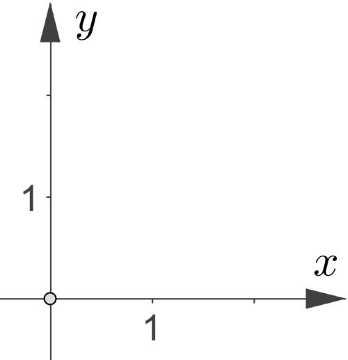
We were taught in school that in a typical rectangular coordinate system, positive values on the x-axis go from the center to the right, and positive values on the y-axis go from the center up:

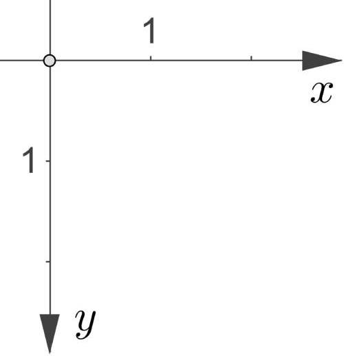
The y-axis is inverted in browsers, and its positive values go down from the center. Remember it so you do not get confused when moving objects. You might have encountered this same feature when using the top property in the course CSS: Positioning:

Reference point
An important feature of the CSS Transform module is the reference point from which the transformation takes place. This point is the upper-left corner of the object. This behavior is very similar to relative positioning, allowing you to use the features of absolute and relative positioning for the same element.
Any HTML object on a page is a rectangle, regardless of its appearance. For example, create a circle and add a border with the outline property to see the lines. The point with coordinates (0, 0) is in the upper-left corner of the element:
Moving an object
To move the object along the x and y use the translate() function for the transform property.
It is an abbreviation of two functions:
translateX()translateY()
It allows you to move the object along the x and y-axes. The syntax of the translate function may differ:
transform: translate(x, y)transform: translateX(x) translateY(y)
As you can see, the transform property can take on several functions simultaneously. It will help when we learn about more of the available features:
Note: the translate () is counted from the zero point of the object, not the page.
Note the way elements overlap when using the transform property. An element with this property will be higher on the z-axis than the other elements, providing all other conditions are the same:
Relative VS Translate
During the lesson, you may wonder why you should use the translate() function when relative positioning and the top, right, bottom, and leftproperties have existed for a long time.
Both approaches will give the same visual result, but, as usual, the devil is in the details. Two devils in this case:
- Using percentage values
- Working with animations
We will discuss the advantages of using the transform property in animation in the corresponding course. In short, browsers process motion animations using translate() faster than they use the positioning.
In this case, we should know the difference regarding percentage values as soon as we start looking at transformations. Often, it is a forgotten point that leads to the waste of time in developing pages. In the example below, there are two squares.
We center them in their columns, after which we apply the following properties:
- Number 1 square:
translateX(50%) - Number 2 square:
left: 50%with relative positioning
Assuming everything else is equal, both squares will have shifted by a different pixel number to the right from their original position. The feature consists of a frame of reference from which we count the relative sizes of these two properties.
For translateX(), this frame is the object itself. For a relatively positioned element, it is the container with it. In this case:
- The number 1 square has been moved
100px / 2 = 50pxto the right. 100px is the width of the square - The number 2 square has been moved
250px / 2 = 125pxto the right. 250px is the size of the column where the square locates
These modifications can be applied when positioning elements within a page. One of the most common tasks is to center the modal window. The positioning course had a similar test. It is hard to do accurate positioning using only absolute positioning. There are dozens of ways to do this, but using a combination of absolute positioning and translate() is the best option.
Additional assignment
Complete the test Html: Modal Box Positioning using absolute positioning and the translate() function.

