CSS: Flexbox fundamentals
Theory: Aligning elements along the main axis
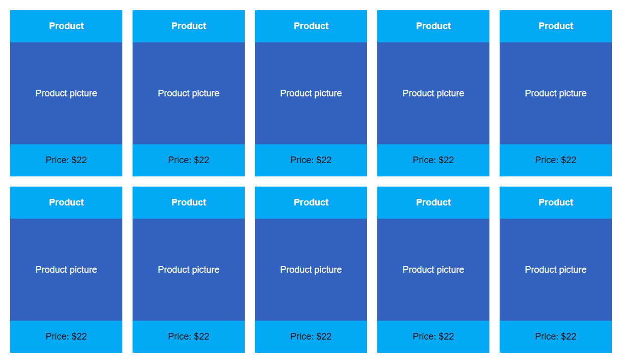
One of the main features of Flex is how it automatically calculates the distance between blocks. Let's imagine a typical layout for a list of product cards in an online store.
In this case, the distance between the cards is 20 pixels horizontally and vertically. Let's try to reproduce this structure using the float property and see what difficulties we face.
I've intentionally removed all the text so that you can see the location of the elements better, without having to go to CodePen. Note that to specify the distance between cards you have to use the margin property, which will be distributed to all elements and will give us an unnecessary margin on the right side of the last card, even though it shouldn't be there. This problem has gotten on the nerves of multiple generations of developers who have tried to get out of it in various ways, including using JavaScript, manually setting a class to override margins, and even using the :nth-child pseudo-class, which appeared only in the CSS3 standard.
With Flex, this problem is solved by one simple rule, justify-content, which can take one of the following basic values:
all changes are made in the .container class
- center. All elements are placed in the center. Let's move our layout into a flex container and set the
justify-contentproperty. For clarity, the body has a gray background and the container has a white one. Additionally, on the second line, the number of elements has been reduced for visual clarity with regards to how the properties work. Notice that the elements in the second line are centered, preserving the same margins between them as in the first line
- flex-start. Elements start at the beginning of the container
- flex-end. Elements start at the end of the container
- space-between. The items are automatically aligned when this value is used. The first element on the line goes in the container's beginning, and the last element goes in the container's end. The remaining elements evenly occupy the empty space. In this case, all the margins along the main axis are calculated automatically
- space-around. This value is a little trickier to work with. Like with
space-between, elements are evenly spread with the same amount of distance between neighbors. However, margins also appear at the beginning/end of the flex container. These margins will be equal to half the margins between elements
- space-evenly. This is the last rule, it sets the same margins on all sides of all elements in a line. Unlike
space-around, the first margin on the left and the last one on the right will not be half that of the margin between elements, but rather the same
These properties will help you fully control the margins between elements within a flex container and change the behavior at any time by changing just one value. This is very convenient when creating adaptive websites.
Alignment along the cross axis
To align elements along the cross axis, we can use the align-content property. It takes the following values:
startendcenterstretchbaseline
Do it yourself
Create a container with several elements inside and give it a different flex-direction from the standard one. Try using the justify-content property to see how it works. This property transformation may be a bit confusing at first, but in a real project, it's an excellent way to work with block alignment.