CSS: Flexbox fundamentals
Theory: What is a Flexbox?
The positioning course dealt with normal flow and some possible deviations from it: floating flow, and absolute and relative positioning. These flows relate to the concepts of block and inline elements. One way or another, it was these flows that controlled or changed all these elements.
The concept of flex introduces new flows you can work with. Take a look at the picture below
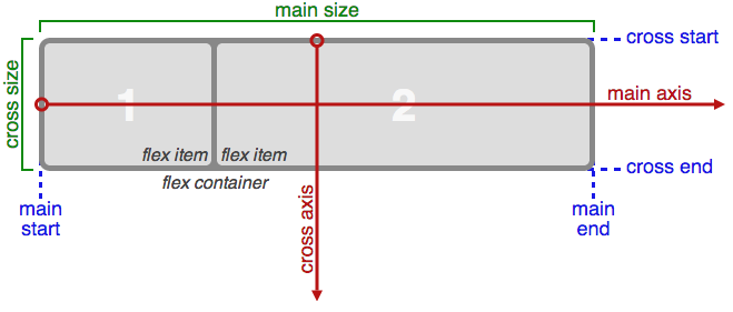
One of the main innovations was being able to make full use of the x (main axis) and y (cross axis) axes. It was easy enough for developers to position elements on the x-axis, and making full use of the y-axis too made it much easier to lay out complex user interfaces. Now we can control the positioning of an element in all axes and any direction at once.
In flex, all elements are placed in special containers, referred to as flex-container. These containers allow the browser understands how to process elements within it. It's a bit like laying out a table, where all elements must be inside the <table> element.
A given block must have the display: flex rule to become a flex container. All of the elements inside are beginning to appear on the main and cross axes.
Note that child blocks are now aligned on the x-axis. An indentation has been placed to the right to show that these are three separate blocks. But it's better not to do that. If you do that, you'll end up with an additional indent on the right side of the last element, which is often not necessary. Flex allows for more flexibility in block width and spacing, which is something we'll explore in future lessons.
Note also that flex containers are not block or inline elements. This means that some of the rules you are familiar with will no longer apply inside this container. Some of these rules include:
floatclear- table properties. For example,
vertical-align(however, this rule is set out by other properties inside the container without issue)
In addition to all of the above, Flex can help you in the following situations:
- Quickly creating adaptive behavior for blocks
- Centering blocks
- Automatically calculating block heights and widths without using JavaScript
- Putting a footer at the bottom of the page ;)
Do it yourself
Using CodePen, create a block with the property display: flex and try to add different elements to this container. See how inline and block elements behave inside the container.